Tuesday, April 23, 2013

Depression vs.Anti-Rape or I'm Indecisive and Can't Choose a Topic

My indecisive-ness is a curse. Along with being insanely short, but that's completely irrelevant. I'm only lucky when it comes to surprise project extensions.

After doing some research, I learned some facts about depression and anti-rape. These are two issues I have strong emotions towards, which is why it's difficult for me to make a decision on what I should base my poster off of.
Depression ad campaigns:


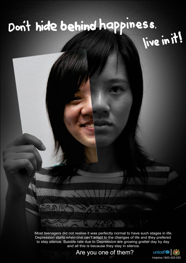
These were a few of the more interesting depression ad campaigns that I found on the internet. They all use a dark or black and white color scheme. The copy used in all of them is serious and minimal, but get the point across. Even though they have a serious tone, they also incorporate a sense of hope or encouragement into their overall message.

Anti-rape ad campaigns:
 
With this topic, I like that there is a variety of ways to convey this message. While doing research I realized that the images regarding this anti-rape seem to be more provocative. The copy in most ad campaigns either promote consent, mention different ways of saying no, or just simply state that lack of consent is rape. Similar to the depression ads, these ones also follow a darker color scheme and minimalism. 

Other things I've been considering in regards to choose a topic are finding the right images I want to use to convey my message on either one. I have a few ideas for copy on both topics but it heavily relies upon how I can visually represent it. If all else fails I'll end up trying to start two separate ones and see which one turns out better. 


Logo Designs

I designed a few new logos for my service learning client in another class I'm in. The only guidelines that were given to me was to change up the color scheme and to try and incorporate a globe.

This is their current one. The client that I meet with says she isn't too thrilled with the color scheme, she wishes there was at least one more color to break things up a bit from looking bland. She also said that that the three stripes remind her of toothpaste. They are very toothpaste-y aren't they? I'm indifferent towards the tagline being included, but I think it could be shorter. 
And these are the ones I designed!

Logo 1: My addiction to the color green and fancy borders is getting pretty serious. I really like the fonts I chose and so did my client. The only thing she wasn't a fan of was the shade of green I had chose. She suggested I change it to a dark violet or a navy blue. I'm going to go back and make those changes and see if she'll like either of them better. 

Logo 2: My client told me this one reminded of a piece of art she saw once. I stuck to primary colors and played around with shapes and lines. I don't think they're going to go with this one. 

Logo 3: This one was the one she seemed to like the most. I made the globe icon myself with the ellipse tool and a few lines, I thought it turned out cute. She also liked that I left some white space within this design because it gives them an option to add a tagline or member position title. 

From the sounds of it, it sounds like she's going to show her boss the 1st and 3rd ones. She asked if there was a way I could somehow combine the two designs. I'm going to give that a go and hope that it will turn out nice.

Tuesday, April 16, 2013

Magazine Layout Project

I managed to survive another class critique last week. This project was kinda fun because it reminded me of when I used to be a hot shot editor for my high school newspaper and had to do page layouts. I incorporated a few things from my last project like my obsession with pastels, cute borders, and carefully thought out fonts. I wish I had chose more interesting pictures for my magazine layout but I was pretty happy with how I placed them. Although the text drove me crazy, I'm really happy with my columns. Perhaps it's just a personal preference.

My biggest struggles were fitting all of the text in and making sure that my pictures didn't look all squished. The text format of course effected how the pictures were laid out which shows they go hand in hand. I'm really glad that I took some advice and moved my title from upper last hand corner to across the page in big font. Someone said my project looked professional, which was very sweet of them because I honestly didn't think I did a great job with it. Maybe it wasn't as awful as I thought it was but there's always room for improvement.


Monday, April 15, 2013

NYLON + Me = Forever

Fashionably late as always, but not too irrelevant I hope. 

As an avid magazine reader since my early teen years, I've always been slightly aware of the lessons and details that we've been learning in class throughout the semester. There's just something about counting down the days until the beginning of the month to grab the latest issue of a fashion magazine that will always excite me. I could flip through those glossy pages and sip coffee forever if I could

I can switch it up of course too. Magazines about movies, TV, etc. amuse me too. I'll flip through a GQ every now and then because of all the gorgeous well dressed men that should marry me of the great articles that give me a better insight of how a grown man's brain operates. I even take those silly quizzes at the end of every Cosmopolitan (don't even get me started on Cosmo. to be continued.) 

But the one magazine that will always have my heart is NYLON. I picked up my first issue when I was around 16 and I haven't missed an issue since. It's more than just a fashion magazine. It's packed with articles about pop culture, music, film, television, books, travel, and other fun stuff. Every page is full of fun vibrant layouts and fonts. They even incorporate illustrations, which adds visual variety. Each column has its own personal flair to it and the main stories have a way of gripping your attention visually with both text and photography.

It truly appeals to ladies (and guys too, they have a men's version - NYLON Guys) of all ages due to its unique aesthetics and its trendy content. NYLON reader for life.